BAEMIN is a consumer food delivery platform operating in highly competitive, low-margin markets such as Vietnam and South Korea. Efficient user acquisition is critical for growth, where even small friction in onboarding can significantly impact conversion and customer acquisition cost.
At the time of this project, BAEMIN Vietnam was seeing an increasing drop-off rate (around 15%) during the first-time user onboarding flow, especially immediately after users opened the app for the first time.
This project aimed to reduce onboarding drop-off with a strong focus on:
What we wanted to achieve:
To evaluate the impact of the changes, we defined the following key metrics:
Together, these metrics balanced user experience improvements with business outcomes, ensuring gains in early engagement did not come at the cost of overall conversion.
To get started, I conducted a heuristic review of the existing onboarding flow, focusing on the very first moments when users opened the app for the first time.
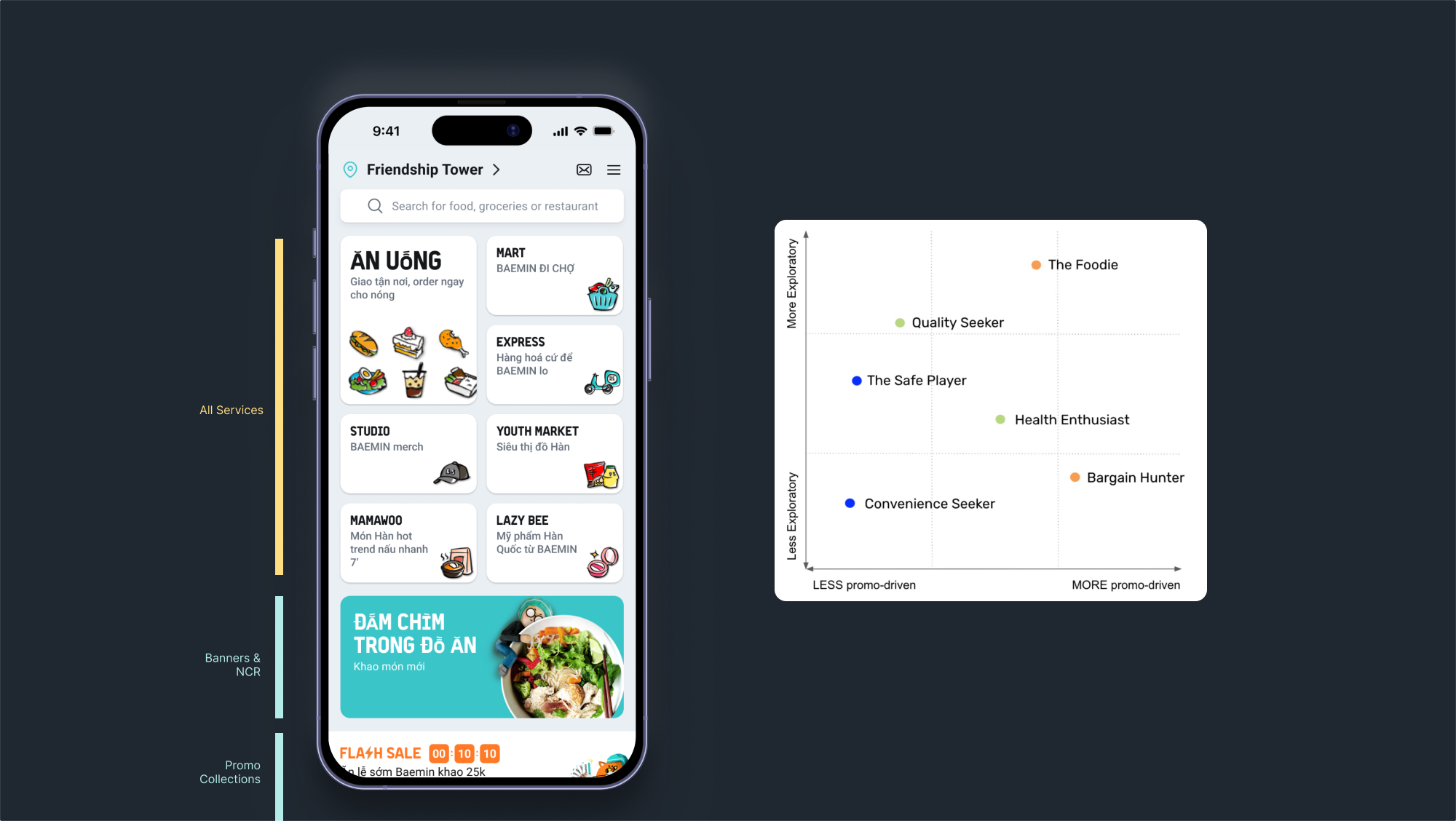
Data showed a significant portion of users dropping at the initial landing screen, so we examined this screen in detail to understand what might be causing early abandonment.
The review revealed that the current design did not clearly communicate value or guide users toward a meaningful next step:
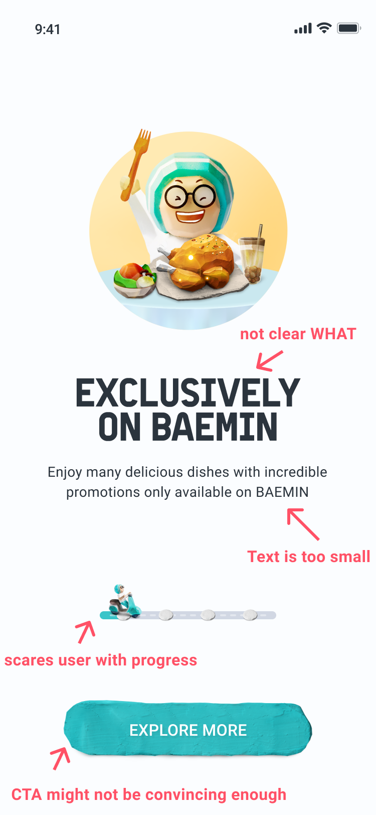
Together, these issues suggested that users were being asked to commit before understanding the value of the product, contributing to early drop-off.
In addition, visual accessibility issues further compounded the problem:
To validate the heuristic findings, I analyzed available onboarding and authentication data to understand how users were performing across key entry points.
Overall conversion from app install to completed account setup was relatively low. Only 60%–70% of users successfully completed the onboarding and registration flow.
This confirmed that a significant portion of potential users were dropping before experiencing BAEMIN’s core value, placing their first order.
The data also revealed a critical issue for returning users. In the forgot password recovery flow, approximately 25% of users failed to reset their password and subsequently abandoned the app.
This meant that even users with prior intent and familiarity were being blocked by friction in early access flows, leading to unnecessary churn and lost reactivation opportunities.
Together, these findings highlighted that onboarding challenges were not limited to first-time users, but extended to returning users attempting to re-enter the product.
To better contextualize BAEMIN’s onboarding challenges, I conducted a competitive analysis across both local and international food delivery apps, focusing specifically on how they handle first-time onboarding, permissions, and registration.
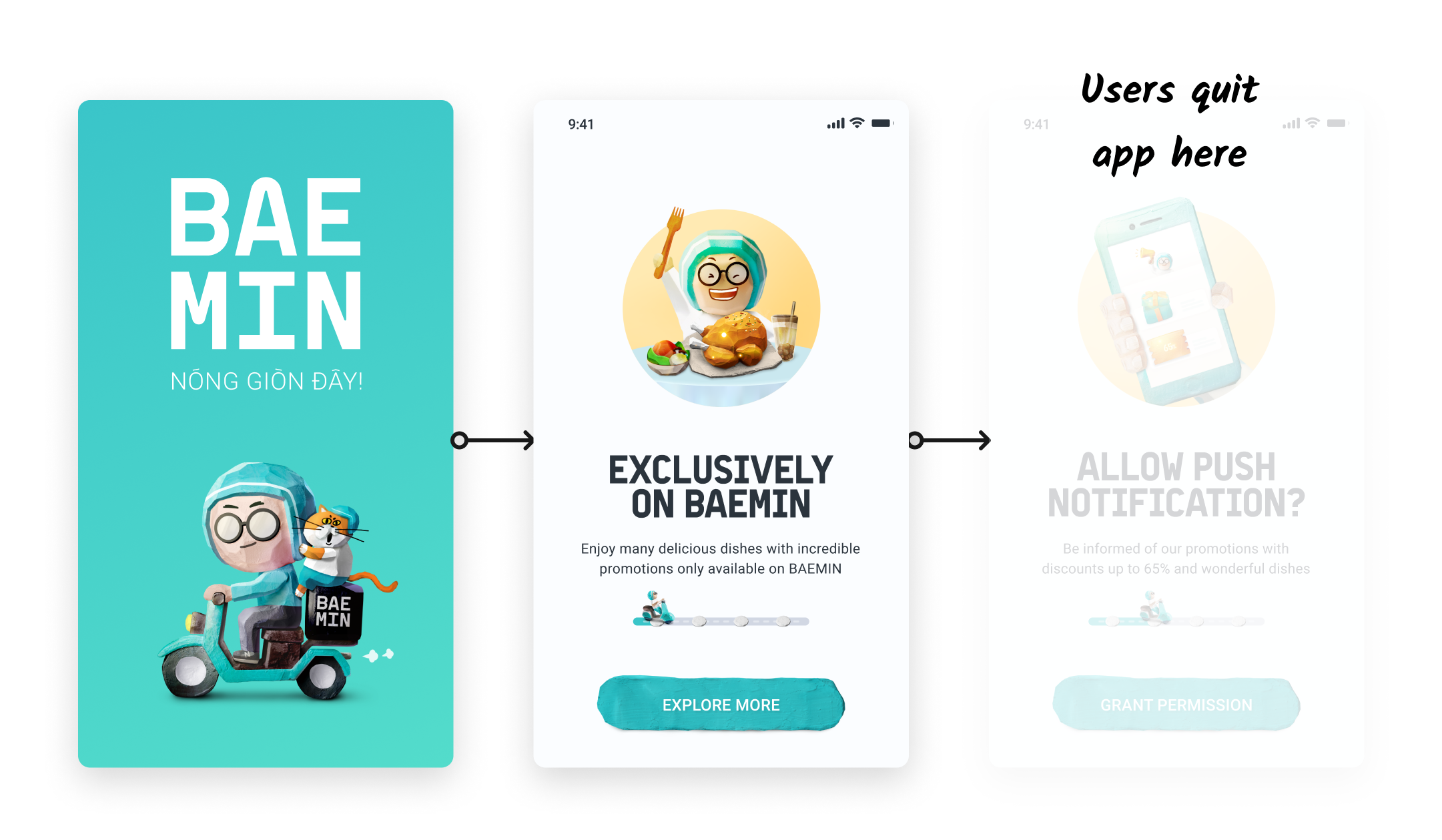
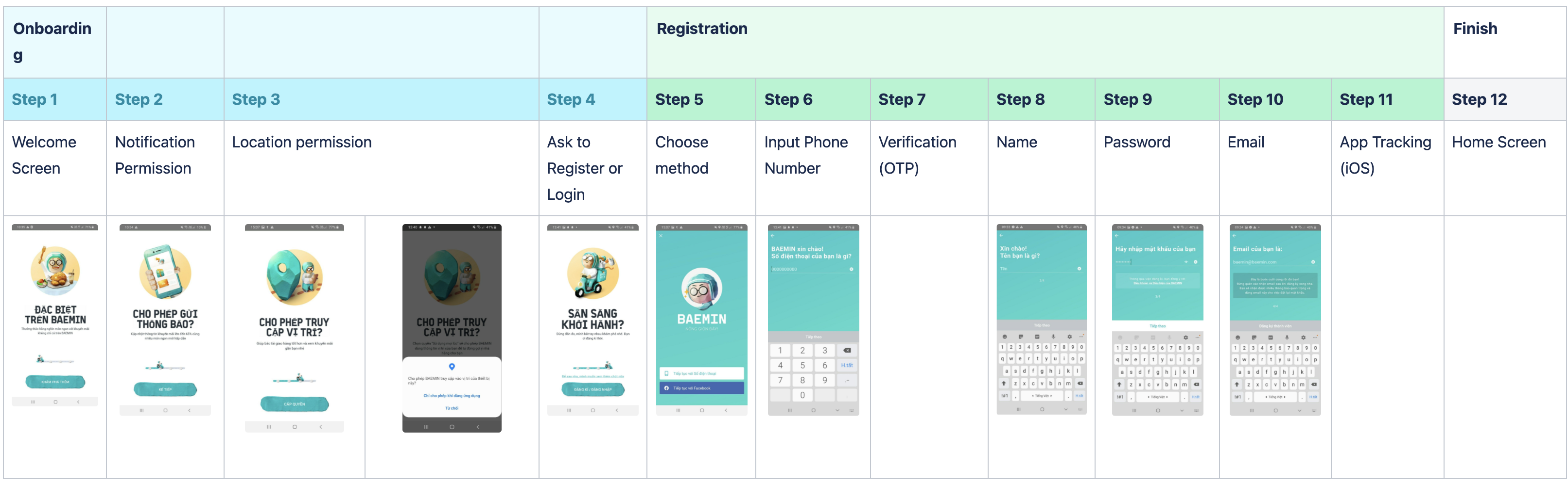
BAEMIN’s onboarding experience was structured into two distinct parts: Onboarding and Registration.
Only after completing all steps would users land on the home screen.
While well-intentioned, this resulted in a long and effort-heavy first-time experience, especially before users had a chance to perceive value.
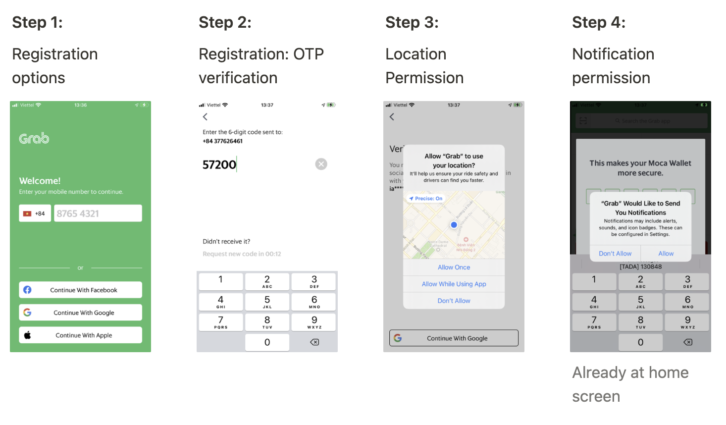
Now, Grab, Gojek
Most locally operating apps in Vietnam shared similar patterns:
Despite this being a common market pattern, it also normalized early friction for users.


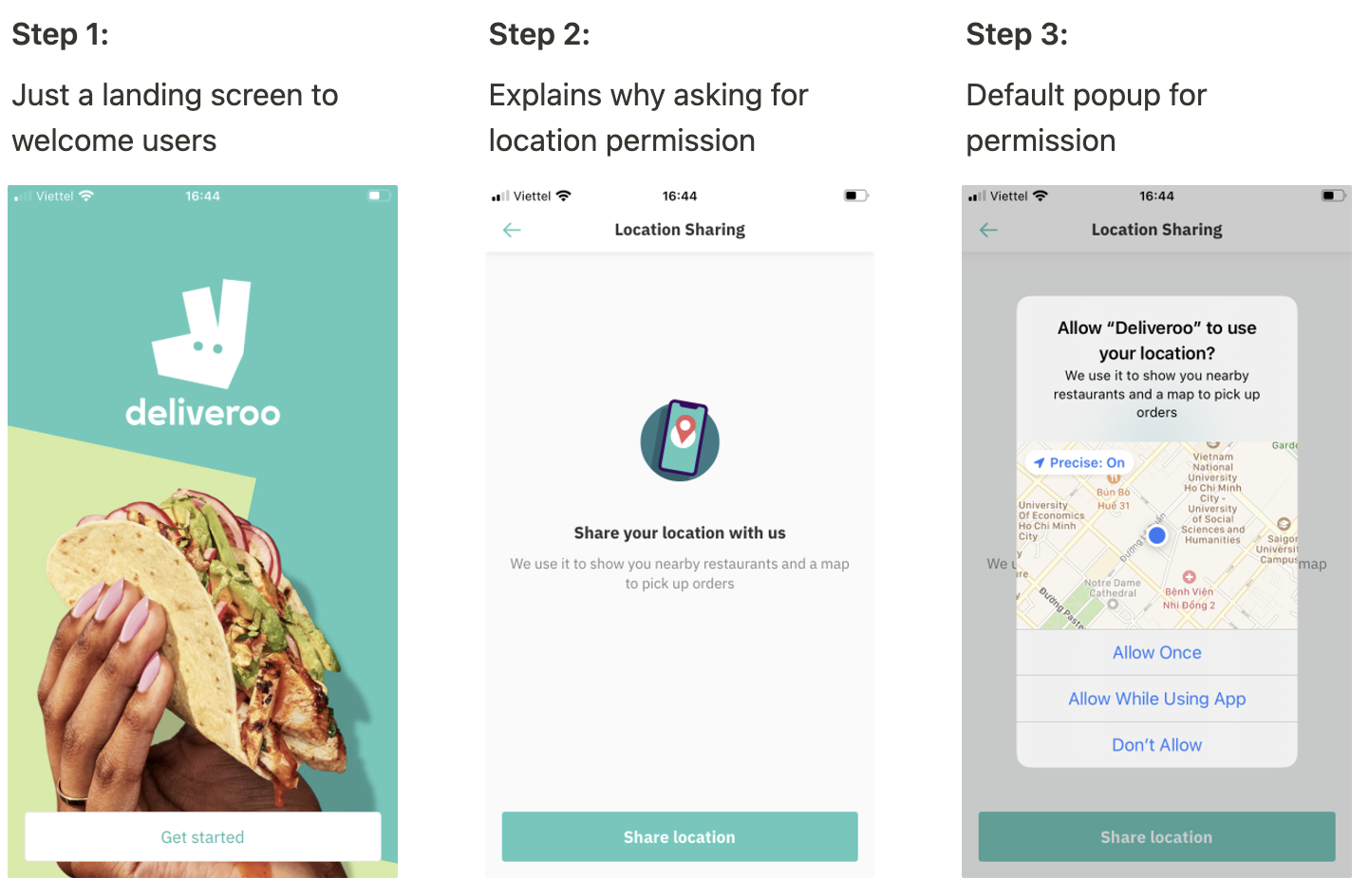
Deliveroo, Uber Eats
In contrast, apps operating outside of Vietnam demonstrated a noticeably different approach:
These products treated onboarding as a trust-building journey, rather than a checklist of system requirements.

The analysis revealed an important mismatch between design intent and market reality.
BAEMIN’s onboarding design, flow, and permission-handling approach were actually closer to international best practices — patient, explanatory, and value-driven. However, BAEMIN was operating in the Vietnam market, where user behavior had already been shaped by dominant local competitors.
As a result, many users were likely less patient with extended explanations and multi-step permission requests during first launch. What worked well in international contexts risked becoming friction in a market accustomed to faster, more direct flows.
Assumption: To reduce early drop-off, BAEMIN may need to selectively adapt its onboarding approach to better align with local user expectations, even if that meant deviating from international patterns and following certain local practices.
This assumption directly informed subsequent design decisions around sequencing, messaging, and permission timing.
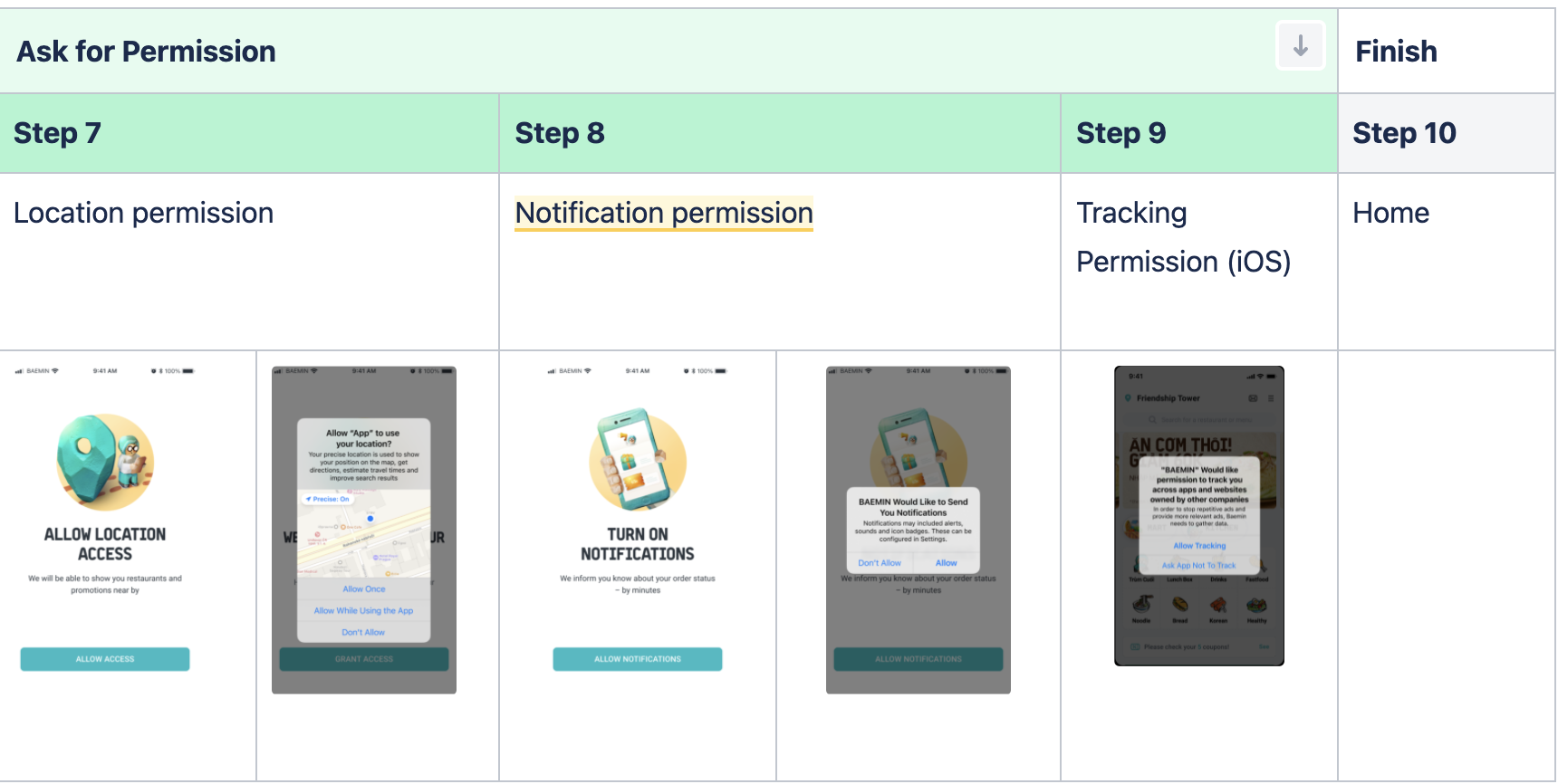
Based primarily on the first and second hypotheses, we made a deliberate decision to rethink the sequence of the onboarding flow.
Instead of asking for system permissions upfront, BAEMIN would allow users to register first, postponing permission requests until they became contextually relevant.
This shift aimed to:
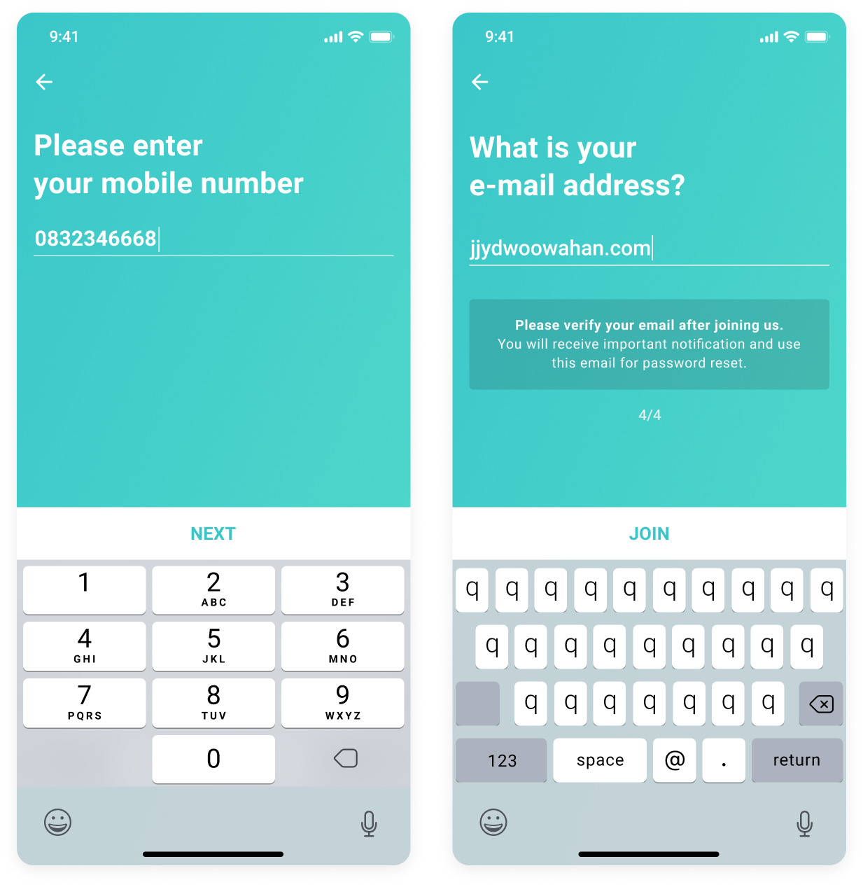
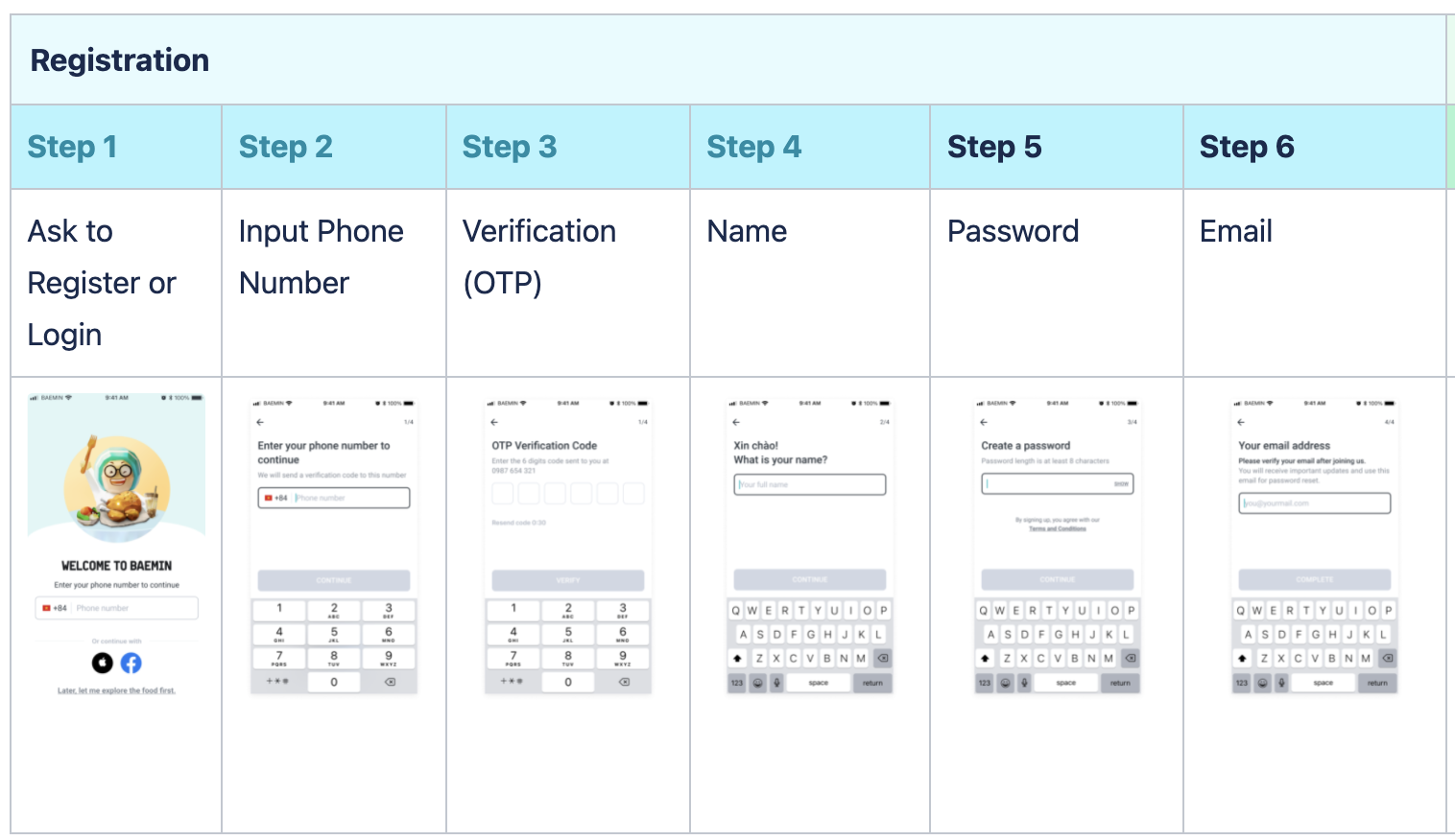
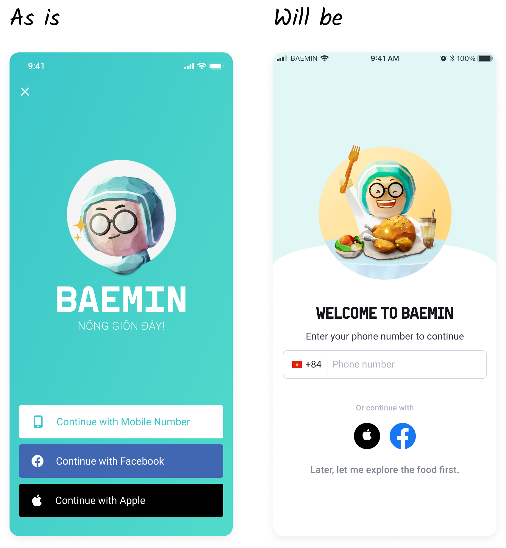
To further reduce friction, the registration flow was redesigned to follow local market practices:
The goal was not to copy competitors directly, but to meet users where they already were, lowering the cognitive and emotional cost of getting started.
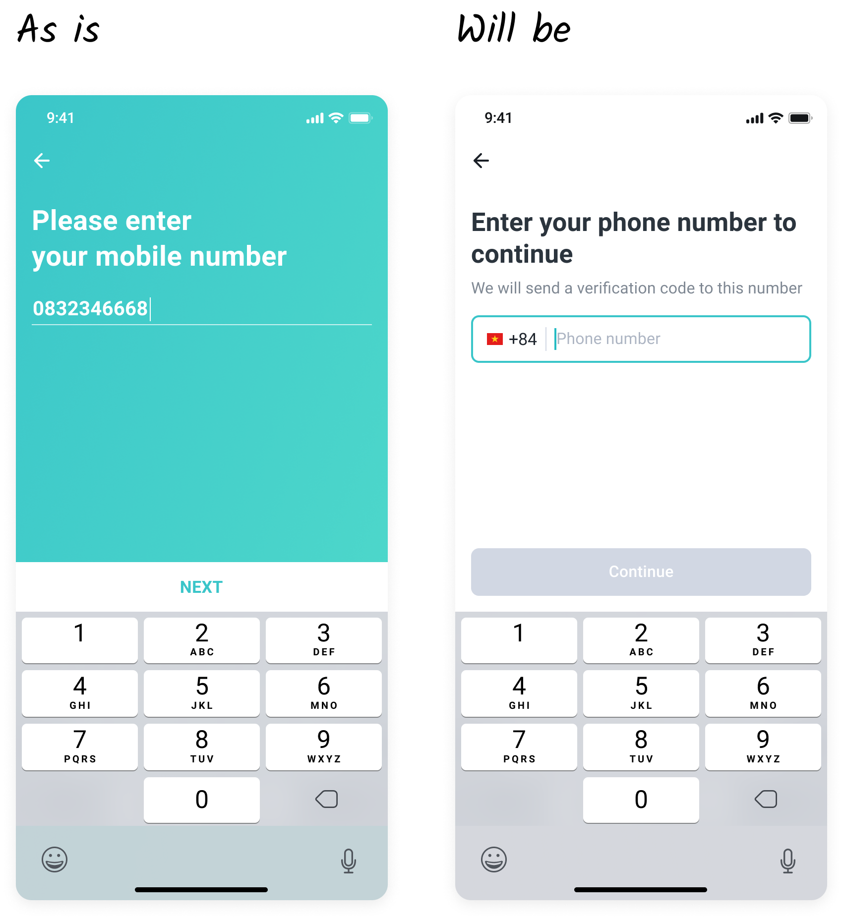
In parallel with flow changes, we addressed visual friction in the registration UI.
The existing design relied heavily on a mint-colored background paired with light, low-contrast text, which made form fields and instructions harder to read—especially during quick, one-handed mobile interactions.
Assumption: Low visual contrast increased cognitive load and hesitation during registration, contributing to drop-off.
Design changes focused on:
These adjustments aimed to reduce unnecessary friction at a moment where users were already investing effort into registration.
I decided to change the brand mint background, even though it is the brand color, but in registration, we need the design to be clear and easy to navigate. Additionally, white and small text on mint background is low contrast and hard to read as well
To closely monitor impact and minimize risk, the new onboarding and registration experience was rolled out gradually:
This approach allowed the team to track behavioral changes, identify anomalies early, and build confidence before full deployment.
The first rollout phase showed clear improvements across all primary success metrics:
Beyond funnel metrics, the improved onboarding experience also drove meaningful business outcomes:
These results validated the core hypothesis that reducing early friction—both in flow sequencing and visual clarity—could materially improve conversion without harming downstream performance.